

Flex-box: Concept of Axis.
This is a quick guide to get started with flex-box by understanding the core concept of axis which is used by various other properties of flex-box.


This guide assumes that you are familiar with HTML.
This guide assumes that you are just a little bit familiar with CSS.
This is a quick guide to get started with flex-box by understanding the core concept of axis which is used by various other properties of flex-box container and its children.
Make sure you have your online editor or any local editor open to quickly get your hands dirty with code.
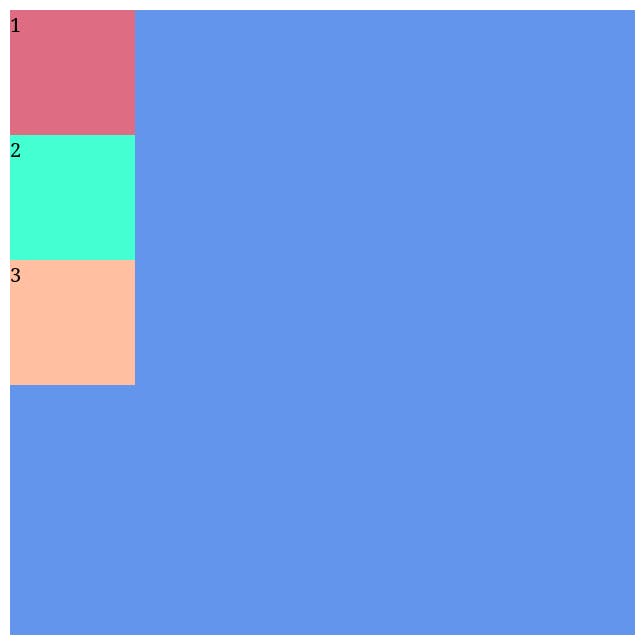
Let us start with a simple layout. Below we have the starter code for HTML and CSS.
Take a moment to copy this code into your editor and get familiar with it.
<section class="parent-container">
  <div class="child-one">1</div>
  <div class="child-two">2</div>
  <div class="child-three">3</div>
</section>
.parent-container {
  background-color: cornflowerblue;
  height: 500px;
  width: 500px;
}

.child-one {
  background-color: #de6c83;
  height: 100px;
  width: 100px;
}

.child-two {
  background-color: #44ffd2;
  height: 100px;
  width: 100px;
}

.child-three {
  background-color: #ffbfa0;
  height: 100px;
  width: 100px;
}
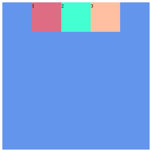
Overview of the above starter code.
In HTML, we have created a
sectiontag which acts as the parent fordivtags.divtags are children ofsectiontag.In CSS, we have used properties such as
background-color,heightandwidth.background-colorsets the background color of an element.heightsets the height of an element.widthsets the width of an element.
Output of this started code is supposed to look like this :
Flex-box in brief
Flex-box is a way to create layouts using CSS. Flex-box is One-Dimensional meaning you can arrange the children of a parent element either vertically or horizontally. Element which has property display set to flex will become a Flex Container and its children will become Flex Items. In a way, flex-box is "flexible" enough to help you bring alive almost any modern layout out there for your web page.
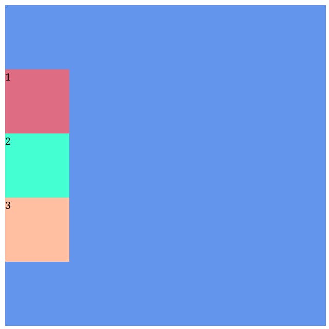
Let us create our own flex-box element by setting display property of our section tag to flex as following.
.parent-container {
  background-color: cornflowerblue;
  height: 500px;
  width: 500px;

  display: flex;
}
We can observe our output now :
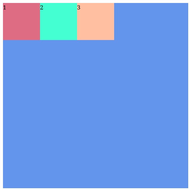
And soon enough we can observe that div being a block-level element takes up the whole width space but now instead each div element takes only the width space which they actually require based on their dimensions and content. Flexible, isn't it?
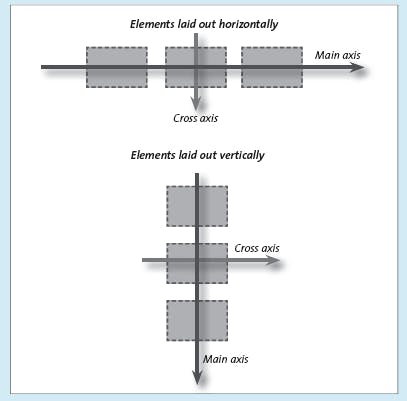
Main-axis and Cross-axis
Each flex-box element has two type of axis, "Main-axis" and "Cross-axis".
Cross-axis is always perpendicular to the Main-axis and vice-versa.
Main-axis can be either in the vertical direction of the screen or horizontal direction with respect to the screen.
CSS Property
flex-directionis used to define the direction of Main-axis.flex-directionhas a default value ofrow. When we setdisplayproperty toflexof an element.flex-directionis by-default to berowwhether explicitly written or not.flex-directionset torowimplies that Main-axis will be vertical with respect to the screen.flex-directionset tocolumnimplies that Main-axis will be horizontal with respect to the screen.
That is a lot to take in but for now, try to remember these points as it will all start to make sense as we progress through our flex-box journey.
Let's start with a question of how are we going to prove last two points mentioned above? To prove the last two points, I will take help from a CSS property called justify-content.
justify-content is a flex-box property which is used to define how a browser distribute extra space around flex items on the Main-axis or we can say align our content with respect to the Main-axis. Now go ahead and set justify-content property to center in your .parent-container selector of CSS but try to guess before-hand that in which direction will your flex items align. Hint is in the last two points.
.parent-container {
  background-color: cornflowerblue;
  height: 500px;
  width: 500px;

  display: flex;
  justify-content: center;
}
And with that, our output will be 🥁 :
So, what was your guess 🤔?
As we can observe, our flex items are aligned with the vertical center of the screen, which means that our Main-axis must have to be in vertical direction since this property works with respect to Main-axis in the first place.
Now can you guess what will happen if I set flex-direction property to column 🤔, always remember those points which are mentioned above. Start by thinking of what will happen to the Main-axis? And how will it affect our justify-content property?
.parent-container {
  background-color: cornflowerblue;
  height: 500px;
  width: 500px;

  display: flex;
  flex-direction: column;
  justify-content: center;
}
And with that, our output will be 🥁 :
So, did you guess correctly this time 🫡 ?
As we can observe, our flex items are aligned with the horizontal center of the screen, which means that our Main-axis must have to be in horizontal direction.
Since last two points are correct, points above those must also be correct since last two points are dependent on previously mentioned points. We can prove in similar manner for Cross-axis.
At this point, I would advise you to go through the above segment again and again until you develop a gist for what has just happened there. Remaining flex properties uses this concept of Main-axis and Cross-axis.
Homework
Revise everything mentioned above.
Try working out beforehand on how
align-itemsproperty will behave in differentflex-directionsituations given that "align-itemsproperty determines how elements are laid out on the Cross-axis".